WHIV
A STUDENT MOBILE APP

Introduction
Whiv is a user-centered mobile app designed as an alternative to Griffith College’s Moodle system. It reimagines the digital learning experience by focusing on the needs, behaviors, and motivations of students and faculty.Using goal-directed design, the app addresses key issues in the current Moodle interface—like cognitive overload, inconsistent UI, and poor information architecture—through a clean, intuitive, and accessible design system.
01
Problem Statement
Students are struggling to use the current Moodle app due to its overwhelming design, confusing navigation, and difficult access to essential academic tools.
Despite being a widely adopted platform, the Moodle app falls short in delivering a user-friendly experience tailored to students' academic workflows. Its cluttered interface and lack of intuitive structure hinder students from completing simple tasks, such as checking deadlines, accessing learning materials, or tracking grades, quickly and efficiently. This calls for a redesign focused on clarity, ease of use, and task-oriented functionality to better meet students' needs.
02
Solution
1. Clear Visual Hierarchy
Organize content by importance to guide users' attention and make key tasks like viewing deadlines and grades easy to find.
2. Task-Based Dashboard
Provide a personalized dashboard showing key tasks and updates at a glance.
3. Clean & Consistent UI
Use a modern, intuitive design system for a smoother and more predictable user experience.
03
Research Method
Survey
User Interviews


Competitive Analysis


04
Analysis of Research/Insight
To better understand user needs, a survey was conducted with 26 students from Griffith College. The aim was to explore their experiences with the Moodle mobile app, identify its pain points, and uncover desired features for a redesigned educational platform.
The responses revealed valuable insights. Highlighted below are three key survey questions that effectively capture the essence of the research, shedding light on user sentiment, common challenges, and expectations for an improved version of the app.
What would make the app more useful or engaging for you as a student?

Many students described the Moodle app as cluttered, with too many unnecessary features that make it hard to find key tools. There’s a clear demand for an interactive calendar with deadlines and notes, along with social features like student profiles and ways to connect with peers. This feedback highlights how the current app creates confusion rather than convenience. The redesign focuses on clarity, simplicity, and essential functionality.
Which of the following features do you use the most?
Most students reported using the app mainly to access lecture materials, suggesting that its core value lies in delivering essential course content. Many also expressed a need for easier access to their attendance records and grades.
.png)
Which of these features would you like the new Moodle app to have?

A strong demand emerged for tools like attendance tracking, to-do lists, and other planning features, highlighting the need for better organization and support in managing academic responsibilities.
Overall, the findings suggest that students not only want easier access to content but also practical, user-friendly tools that enhance their experience. Many are unaware of existing features, indicating a need for a more intuitive and comprehensive platform.
05
Ideation
Social element
To do list
Advanced calendar
important features placed in homepage
Switch theme mode
for student for visual impairness
Graph for what student done so far and whats left?
opt for showing grades or not
students can access only one app to get what they need
eg. attendance,, upload drafs,
group project


.png)


06
Iteration
.png)
Low-Fidelity Prototype
.png)
Final Prototype
07
User Interviews
Students found the design easy to navigate and visually clear, making it simple to check deadlines, access materials, and stay organized. They especially liked the clean layout and how everything felt intuitive and familiar.
Research Questions
1. Can you describe your first impression of this design?
2. Was it easy to find what you were looking for (e.g., deadlines, course materials, grades)? Why or why not?
3. How did you feel while completing tasks on this app? Was anything confusing or frustrating?
4. What features or elements stood out to you the most? In a good or bad way?.
5. If you could improve one thing about this design, what would it be?
08
Final Design


.png)

.png)
.png)

.png)
.png)

09
Style Guide
Iconography


UI Component

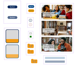
No third-party icon libraries were imported. All designed by me.
Color Palette
.png)
Typography
Primary Font: Khmer
SecondaryFont: InterFont
Sizes:H1: 36px,Bold, Line Height: 64H2: 24px,Medium, Line Height: 64
BodyText: 16px, Regular
Small Text: 14px, Regular
FontWeights:Regular (400), Medium (500), Bold (700)
10
Reflection
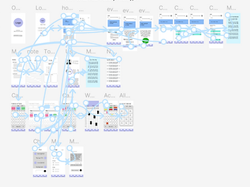
The redesigned Student Moodle App (Whiv) addresses key pain points of the original version by offering a cleaner interface, improved navigation, and essential tools like an interactive calendar, attendance tracker, and to-do list. The home screen acts as a central hub, making important information easily accessible. A consistent color scheme, clear typography, custom icons, and theme-switching improve both aesthetics and accessibility.Key successes included meeting all design goals, maintaining a steady workflow, and using Figma for effective collaboration and iteration. Designing custom UI elements helped maintain a cohesive visual style.Areas for improvement include expanding user research beyond 26 participants, exploring more advanced Figma features, conducting deeper usability testing, and experimenting with visual variations. Overall, the project highlights the importance of user-centered design and continuous feedback in creating a functional, engaging platform that supports students’ academic needs.