Gear4Music
Redesign the Website
.png)
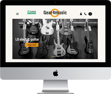
Gear4music is an online retailer offering a wide selection of musical instruments, audio equipment, and accessories for musicians of all levels. While the platform provides useful features like product filters, search options, and detailed listings, the overall user experience falls short. The website feels outdated, cluttered, and visually inconsistent, making navigation difficult and frustrating for users. A redesign is needed to improve usability, accessibility, and visual clarity.
01
Problem Statement
Despite offering a wide range of musical products, the Gear4music website presents a cluttered and overwhelming user interface. The excessive amount of content, inconsistent colors, and poor visual hierarchy make it difficult for users to navigate the site and find what they need. Key processes such as product discovery, comparison, and checkout are unclear, leading to a frustrating user experience. This not only affects user satisfaction but can also negatively impact the business through lost sales and reduced customer loyalty.
04
Goals/Objectives
To redesign the Gear4music website with a cleaner, more intuitive interface that simplifies navigation, improves visual consistency, and enhances the overall user experience. The aim is to reduce cognitive overload, clarify key user journeys and create a visually appealing layout that supports both user needs and business goals.
Clarity
Usability
Consistency
Efficiency
04
User Research
To better understand user frustrations with the current Gear4music website, I conducted interviews with 5 users, ranging from beginner musicians to experienced performers, who had previously browsed or purchased from the site.
The goal was to identify pain points in the user experience and uncover opportunities for improvement.
Key Insights:
All participants felt the interface was visually cluttered and overwhelming.
Users found it difficult to locate specific products due to the lack of visual hierarchy and inconsistent layout.
Several users mentioned the color palette and typography felt outdated and distracting.
The checkout process was described as confusing and lacking clarity, especially for first-time buyers.
Users expressed a desire for a simpler, cleaner, and more focused experience that helps them achieve their goals faster.
05
Solutions

This wireframe presents the product detail page in a simple, easy-to-understand layout. It features product images, pricing, and an 'Add to Cart' button prominently displayed. Unlike the current website, which is text-heavy and cluttered, this design allows users to collapse the product description for a cleaner view. It also includes sections for similar products and customer reviews. All original content is retained, just reorganized in a more user-friendly and visually clean way.

This wireframe showcases a clean, minimalistic layout featuring a sliding carousel to highlight promotions, new arrivals, and key announcements. Just below, products are displayed clearly with essential information, making it easy for users to browse and shop efficiently.

This is the redesigned checkout page, where users can fill in their personal details and card information all on a single screen. In the current website, the checkout process involves too many steps, and users don’t see the total amount until the final stage, which can be confusing and frustrating. In this design, the total cost is clearly visible throughout the process, giving users full transparency. A step tracker is also included to guide users through the process and show which stages have been completed, making the experience smoother and more reassuring.
06
Final Design

.png)


.png)
07
Reflection
Redesigning the Gear4Music website has been a valuable learning experience. Through the process, I identified how poor visual hierarchy, cluttered content, and unclear user flows can negatively impact both user satisfaction and business performance. By simplifying the layout, improving navigation, and making key elements like product information and checkout steps more transparent, I was able to create a cleaner, more intuitive experience.Although I did not conduct real user testing, the feedback from mock interviews and observations helped shape a user-centered approach. I focused on decluttering the interface, highlighting essential information, and maintaining all core functionalities of the original website, just presented in a more organized way.This project helped me strengthen my wireframing and UX thinking skills. It also reminded me of the importance of accessibility, clarity, and visual consistency when designing for a broad range of users. If I were to take this further, I would conduct real usability tests to validate the effectiveness of the redesign and iterate based on real user behavior.